 I have been involved with the website at my church almost since websites began. I created the first website for LBC back in 1999 using the free webspace provided by Compuserve – one of the early internet service providers.
Since then, the website has been through various designs and used various delivery mechanisms – frame-based HTML, Flash-based design and static HTML. Things really got much easier and collaborative when we moved to a WordPress based system which meant we could have multiple people contributing and could easily change themes when necessary.
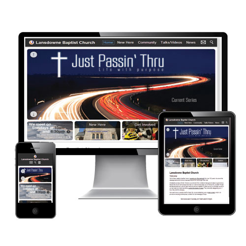
However, nothing stands still in this area and we were aware of the need to support the growing number of devices that were accessing our site – mobile phones, iPads, other small-screen tablets and now Smart TVs. We knew that we would have to do some radical maintenance to bring our site up to date.
So, at the start of 2013, those of us who work in the media and web sphere met together to discuss how we could design a new responsive site that would adapt to any sized display or orientation without changing the experience for the user. These 5 steps should help you if you’re thinking of doing something similar for your church web site.
1. Who is the website for?
We met to review why we had a website. Was it for those who meet regularly each Sunday? Was it to be a resource for people moving into the area and looking for a church? Should it be evangelistic? Unless you know who your site is really targeting your going to have trouble knowing how to design its menus and style. This is key to getting things right.
2. What works and what doesn’t?
Check through your website stats and see which pages most people use. Is it the weekly news/what’s on section? What about your podcast download page? How many people read your Sunday School section? What you’re hoping to find here are the areas which most people find useful when visiting your site. You don’t want to take away something that is widely used and appreciated when you do your new design.
Conversely, if there are pages that are visited less often, think about whether they’re really necessary to take forward into the new design – are there alternative outlets for that information which may be more effective instead of burying them somewhere on the website?
3. Are you going to “go responsive”?
This is a big question to ask yourself. Responsive designs adapt to the screen size used by the visitor so that the same, or similar, experience is provided whether they’re using their iPhone or a Smart TV. However, many devices have alternative methods of displaying sites on their smaller screen-estate, so you may think that investing lots of time into making your site responsive is better spent elsewhere (on content perhaps)?
There certainly are benefits to going responsive if you can – using a Content Management System such as WordPress means you can switch to a responsive theme fairly easily. There are many available. Some are free and others are quite reasonably priced so it is worth looking into. This site you’re reading now uses a free WordPress responsive theme.
At LBC we are really blessed to have volunteers within our congregation who are experts in WordPress theme design, graphics design and general technical wizardry to be able to create a theme that would be tailor made. This meant we could have a custom responsive design and still keep the simple content maintenance that WordPress provides.
4. What is your style?
Each church has its own unique style, look and feel whether it’s intentional or not! Your website should reflect who you are, not someone else. You don’t want your website to misrepresent you – visitors who come to your church as a result of seeing your website will feel they’ve been mislead.
You want your site to be a reflection of who you really are. So this may also be a time to meet with the leadership of your church and discuss the style and look/feel the website should provide. Without knowing this, it will make your job much harder. What sort of images should be used? Colour scheme – tone of language (e.g. hip and trendy or conversational)?
Personally, I like to see a church website that contains good photos of real people who actually attend the church, not shiny stock photos. Imagine first time visitors recognising people because they’d seen them first on the website! Remember, a church is people not a building, so that’s what visitors to your site should see first.
Please, please, please don’t use clip-art! Never! Just stop it. Now!
5. Who will maintain the content?
Be aware that maintaining your site should be a frequent activity. In order to have people use your site regularly there has to be something worth coming back for. Otherwise, you could simply print it all out and do a mail drop.
There are all sorts of areas on a church website that can be updated regularly:
- What’s on this week/coming up soon/events
- Photos and report from a recent event (youth camp; praise evening; conference)
- Details of the current or next teaching series
- Pastor’s blog
- Audio/Video of talks/sermons
While this makes for an interesting, fresh site – it also imposes a time commitment from yourself and volunteers. Think about spreading this load by asking each ministry within your church to either contribute directly (give them ‘author’ access to WordPress for example) or to email you a document of their recent activities with photos.
One of the advantages of having an in-house web theme developer at LBC was that we were able to integrate Google Calendars into our What’s On page but keep the look, feel and responsiveness of the rest of the site. This makes adding events and weekly meeting information a simple task of adding it to centrally available calendars.
Can you think of any other questions you need to ask when redesigning a church website? How are church web sites different from secular sites and how does that change how we should approach changing them?
Let me know in the comments. I’d love to hear what you think or what experiences you’ve had in this area.


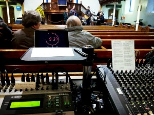
 This week has become one of the busiest so far this year in regard to audio requirements at church.
